
Whether you want to adjust the white balance, correct the color cast, or bring out the vibrancy of certain tones, lightroom offers a powerful and user-friendly toolset for making these edits. By using the develop module and leveraging the various adjustment sliders available, you can fine-tune the colors in your images, ensuring they appear natural and visually appealing.
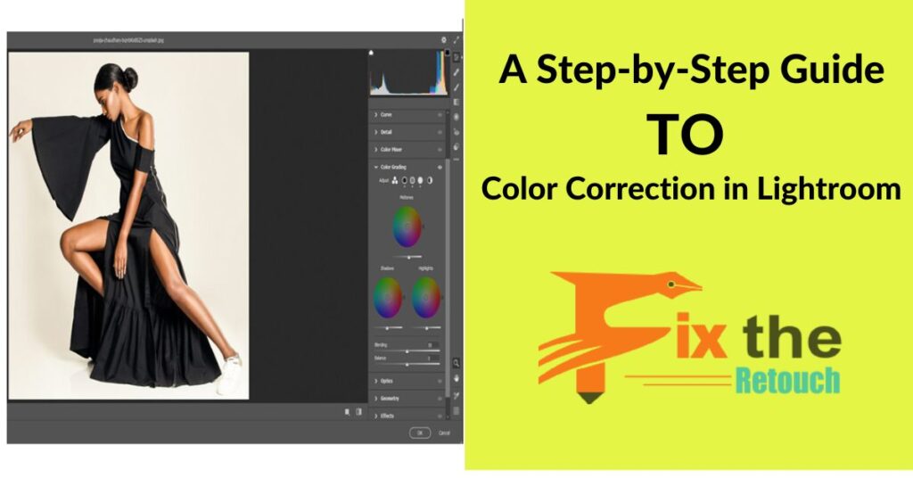
In the realm of post-processing, color correction holds the key to refining the visual allure of photographs. Adobe Lightroom, a prominent photo editing tool, emerges as a quintessential companion in this journey of precision and artistry. This comprehensive guide embarks on an illuminating journey through the step-by-step process of color correction in Lightroom, unraveling the intricacies of hues, tones, and balance, while equipping photographers with the expertise to transform images into captivating works of art.
Grasping Color Essence
Fundamental Color Insights
A solid foundation in color theory unveils the enchanting world of hues, tints, and shades, imparting an understanding of color interplay and its profound impact on imagery.
Harmonizing with White Balance
Delve into the realms of color temperature and white balance, where the delicate equilibrium of warmth and coolness takes center stage, ensuring authenticity in color representation.
Paving the Path for Workflow
Organizing Imports
Navigating the initial steps, learn the art of importing and organizing images to establish a structured foundation for seamless color correction endeavors.
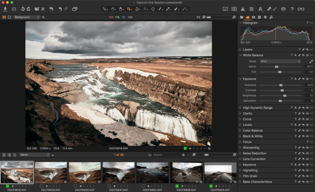
Unveiling Lightroom Interface
Unravel the intricacies of Lightroom’s interface, specifically the Develop module, where the transformative journey of color correction unfolds, accompanied by insightful insights into Histogram, Basic Panel, and Tone Curve tools.
Foundational Color Correction Techniques
Orchestrating White Balance
The temperature and tint sliders take center stage as you navigate the path to authentic color equilibrium, eliminating unwelcome color casts and bestowing images with pristine whites and grays.
Mastery of Exposure and Contrast
Embark on the journey of exposure and contrast adjustments, harmonizing tonal dynamics and ushering images into a balanced realm of visual resonance.
Dance of Saturation and Vibrance
Saturation and vibrance adjustments come alive, allowing you to amplify or temper colors without compromising the natural essence of skin tones.
Navigating Color Channels
Harness the power of Hue, Saturation, and Luminance sliders to orchestrate the nuanced symphony of individual color channels, rectifying imbalances and embracing artistic ingenuity.
Unveiling Advanced Color Techniques
A Symphony of Split Toning
Embrace the artistry of split toning, where highlights and shadows dance to the rhythm of distinct colors, imparting a touch of uniqueness and enchantment to your visuals.
Crafting the Color Narrative
Journey into the realm of color grading, where a coherent palette weaves the tapestry of visual storytelling, casting a captivating spell across a series of images.
A Deeper Dive: HSL Mastery
The HSL panel beckons, allowing the mastery of precise color manipulation as you curate the hues, saturations, and luminances that shape the soul of your photographs.
Calibration’s Artistry
Peel back the layers to unveil camera profiles and the Calibration panel, wielded deftly to bestow your images with a consistent and desired color rendering.
Finesse Through Localized Mastery
Filters of Graduation and Radiance
Harness the magic of Graduated and Radial Filters, directing color enhancements to specific image zones, attaining equilibrium and finesse with precision.
Brushing the Canvas with Adjustment
The Adjustment Brush takes center stage, allowing for intricate brushstrokes of color correction to adorn select elements of your image, rendering a harmonious masterpiece.
Workflow Efficiency and the Grand Finale
The Art of Presets and Profiles
Streamline your voyage with presets and profiles, accelerating your color correction journey while maintaining the sanctity of your creative touch.
The Elegance of Visual Transformation
Immerse yourself in the ‘Before and After’ view, where the metamorphosis of color correction unfolds, empowering you to gauge the efficacy of your endeavors.
The Culmination: Exporting Brilliance
Bid adieu to your color-corrected marvels as you navigate the export realm, ensuring your images radiate their true colors across digital platforms and printed canvases.
Why Should I Use Color Correction In Lightroom?
Using a variety of amendments in Lightroom can altogether improve the general visual nature of your photos. By further developing variety exactness, redressing white equilibrium, and making exact changes in accordance with explicit shades and tones, you can make pictures that are more energetic and consistent with life. This cycle is fundamental for proficient photography and configuration work.
- Enhance Color Accuracy: Correct colors to match the real-world appearance.
- Improve White Balance: Adjust the temperature and tint for a natural look.
- Increase Visual Appeal: Create aesthetically pleasing images.
- Correct Exposure Issues: Balance shadows, highlights, and mid-tones.
- Achieve Creative Effects: Apply artistic color grading for stylized looks.
- Maintain Consistency: Ensure uniformity across a series of images.
- Professional Quality: Meet industry standards for print and digital media.
- Versatility: Use various tools and presets for different correction needs.
- Efficient Workflow: Integrate color correction into a streamlined editing process.
Conclusion
With Adobe Lightroom as your artistic vessel and this comprehensive guide as your compass, you are poised to embark on a journey of color correction mastery. As you navigate the intricacies of hues and tones, you unlock the transformative potential of your images, fostering an emotive connection with viewers. With practice, dedication, and a keen eye, your color-corrected artworks will narrate stories that resonate deeply and leave an indelible mark on the canvas of visual storytelling.